A menu is not a list of prices in the world of hospitality; it is a salesperson. In both mobile vendors and brick-and-mortar coffee shops, the design and functionality of the display can be the difference between a long queue of interested customers and a baffled crowd walking off. The following is how to master both.
Food truck menu boards are a unique challenge
A food truck works in disorder. It competes with the noise of the city, traffic, scorching sun, and customers with only 30 seconds to decide before the line pushes up to the sidewalk. Food truck menu boards must compete with visual clutter in a way indoor restaurants rarely face.
Size and legibility
The most important principle of a food truck board is big and bold. Many trucks use vinyl decals on their service window or an A-frame board outside. The current trend, however, is toward backlit LED panels. Since the customer stands outside and is frequently squinting, what is written should be readable from at least 15 feet away. Avoid script fonts; use sans-serif. If a menu has 15 items, cut it to 8. A cluttered food truck board creates decision paralysis, killing transaction speed.
Weatherproofing and flexibility
Food trucks are mobile. Boards must handle rain, wind, and UV rays. Laminated posters are inexpensive, but they tear. Many food truck menu boards work well as magnetic boards, where magnetic strips can be replaced with daily specials. Luxury trucks are embracing weatherproof digital screens that automatically regulate brightness, but this requires a strong power setup. For many vendors, a chalkboard with high-contrast chalk markers remains the gold standard—cheap, adaptable, and attractive.
The upsell opportunity
A prominent section of a truck board should be a “Combo” section. Lines move fast, so customers do not have time to do mental calculations. A clear offer like Burrito + Chips + Soda = 12 sells better than items listed separately. Use arrows and simple icons (a taco icon, a soda cup) to lead the eye.
Art of cafe menu boards
Cafe menu boards focus on atmosphere and storytelling, while food trucks focus on speed and durability. Customers linger in cafes. They read. They compare a cortado to a flat white. A cafe board should balance teaching and beauty.
Hierarchy of coffee
Many cafe boards fail because they list every drink an espresso machine can make, creating a wall of text. The solution is logical grouping: Espresso, Brewed, Blended, Tea, and Seasonal. The real secret is placement. The highest-grossing product (typically a seasonal latte or cold brew) should be in the upper-right part of the board, which eye-tracking research has shown is a powerful position.
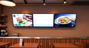
Format war chalkboard vs digital
Cafe owners face a stylistic decision. A big, hand-crafted chalkboard signals craftsmanship, local sourcing, and a friendly atmosphere, and it fits rustic or vintage styles. However, to alter prices or introduce another syrup flavor, it takes an artist’s time.
Digital cafe menu boards (small TV screens behind the counter) can be changed in real time, such as turning off the hot chocolate display when it runs out. The risk is that screens can feel impersonal in a homey cafe. Many owners compromise by keeping the core menu on a static chalkboard and using a small digital sideboard for daily specials and merchandise.
Managing choice overload
Specialty coffee can feel intimidating to new customers. A cafe menu board should act as a guide. One-line descriptors can help: Cortado – Balanced, less milk or Americano – Bold, no milk. This reduces anxiety and speeds ordering. Also, do not use small print prices. Clear pricing builds trust. If a latte costs 6.50, write it.
Food truck or cafe style which is better
It is not a contest; it is context. Speed, outdoor durability, and size are the priorities of food truck menu boards. If reading the truck board takes 60 seconds, sales are lost. Cafe menu boards focus more on ambiance, education, and logical progression. If a customer spends 60 seconds reading a cafe board, they are probably enjoying the process.
Errors to be careful of
No matter what kind of business it is (truck or cafe), avoid these three mistakes:
1 No visible prices: Customers dislike asking “How much is this” and it reduces impulse purchases.
2 Stale boards: If a cafe board still shows Pumpkin Spice in January, it looks careless. If a food truck board has a tattered Closed sign, replace it.
3 Ignoring height: Food truck boards at eye level (around 5.5 feet) perform well. Boards placed too high behind the barista are less effective—move them toward the queue.
The future of cafe and mobile display
QR codes are filling the gap. Food trucks now use progressive menu boards with a small QR code that links to a mobile order page, letting customers order as they walk up. Likewise, upscale cafe menu boards are becoming part of loyalty apps, showing the customer name and regular order as they scan their phone.
For independent owners, the rule is simple: the board is not a database. It is a “clip compilation.” It should make the hardest choice easier—What do I want—whether selling tacos off a truck or pour-overs in a corner. Invest in contrast, clarity, and context. Daily sales will reflect it.
 :
https://pin.it/1CqdAFnxR
:
https://pin.it/1CqdAFnxR